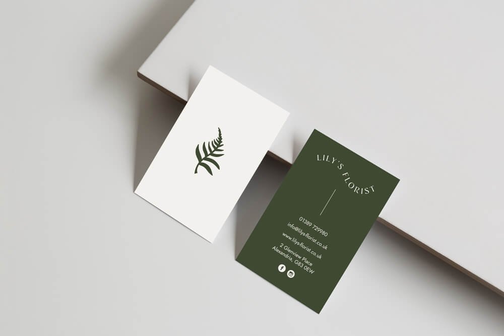
Lisa came to me for a total brand overhaul, website and all to match her new shop interior decor.
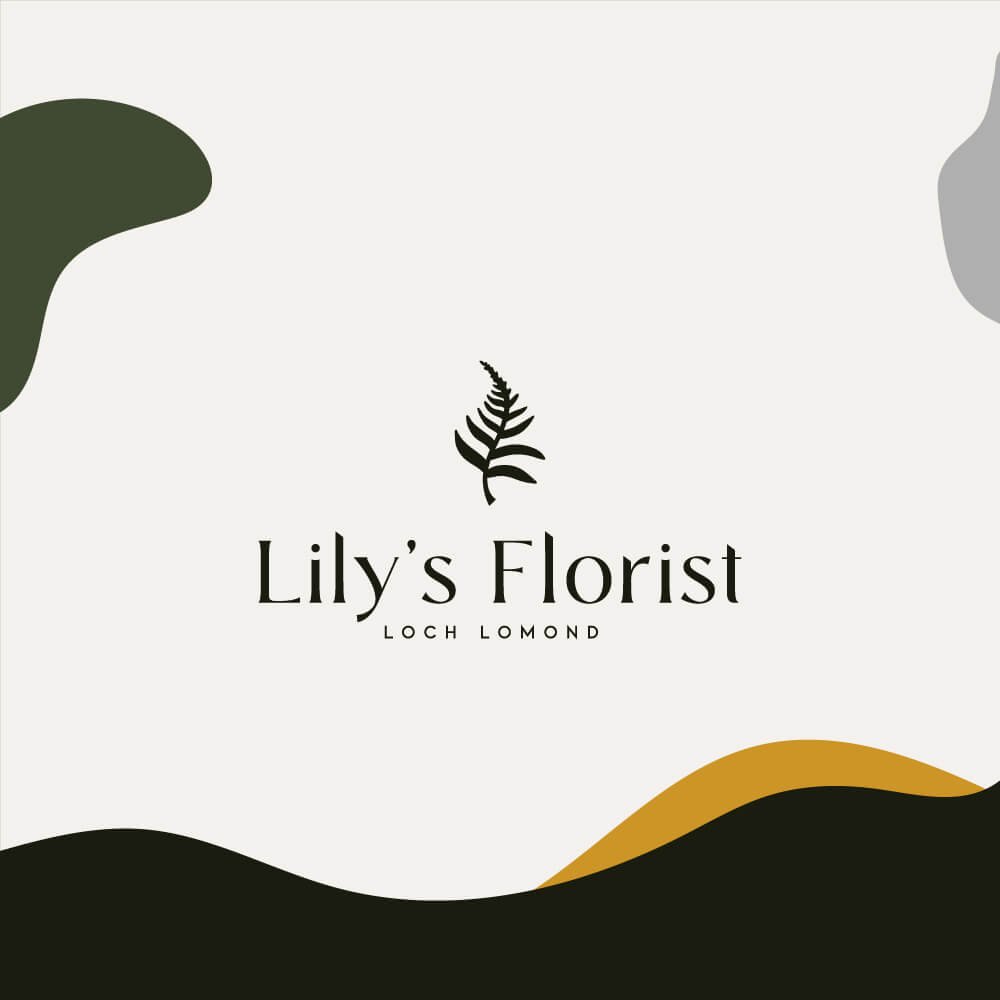
She felt as though her previous branding no longer said what she wanted it to about her business. She wanted to uplift her look and stand apart from her local and national competition. The inspiration was bold, clean with an urban outdoors feeling. No pastel or neutral shades here.
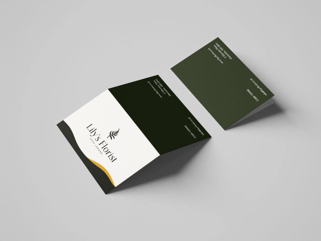
Lisa had always used an element of a fern in her logo, and wanted to bring this forward into her new identity but in its simplest form. A simple silhouette with no chance for mistakenness and super clean edges.
The new Lily’s Florist website is still in the works, but it’s coming soon! In the meantime, you can find Lisa and her beautiful floristry work on Instagram.
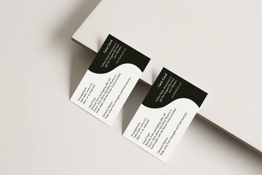
Take a look at some of the work we created below.
Services included:
Logo Design
Rebrand
Colour Palette and Font Selection
Website Redesign
Business Stationery
Illustrated Icons
