Twins Rosie and Jess created an event styling business after enjoying curating and crafting Jess’ own wedding. They were growing their small business and wanted their branding to help take them to the next level.
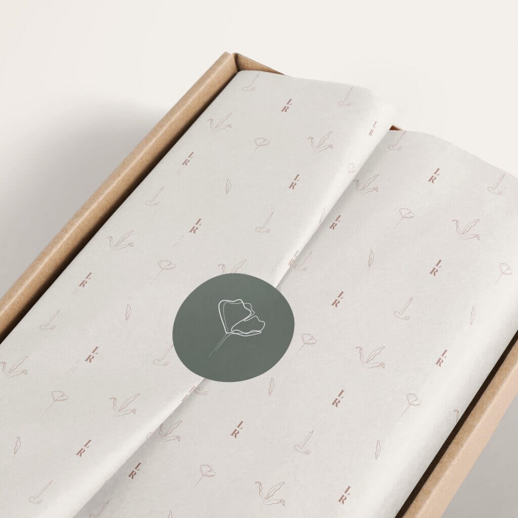
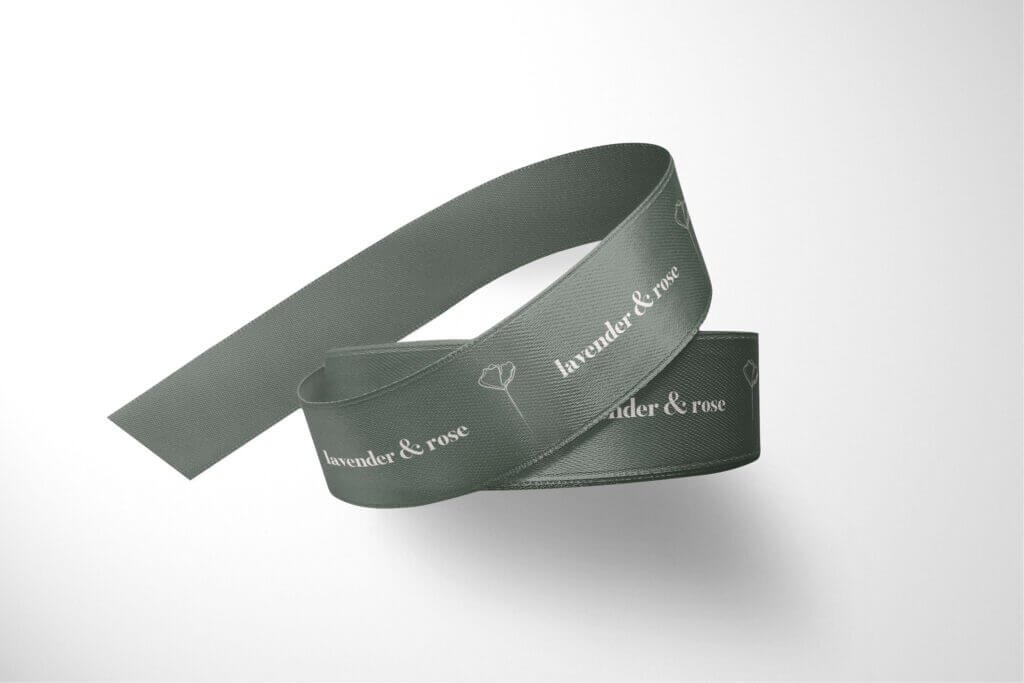
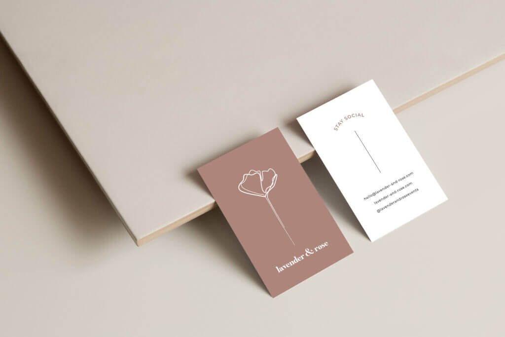
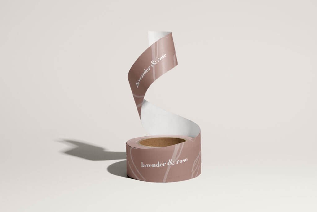
Their new brand identity was to be clean, elegant, feminine and earthy. The logo was based loosely on one of Rosie’s favourite flowers, the Margaret Merril rose. The flower is drawn in one clean, organic line and signifies a journey of paths crossing and coming together. This paired with a dusky, natural colour palette gave them the look they were hoping for.
Rosie and Jess have only moved from strength to strength in the time since their rebrand, and you can keep up with them via their instagram or website.
Read Rosie’s testimonial here.