Ola bought Azalea Flowers from two ladies who opened and had been running it since 1990. The branding hadn’t been changed since the beginning so was in need of a refresh.
Ola wanted her new branding to be neatened up around the edges to match her new, dark grey, clean shop interior but didn’t want to put off her local and loyal customers. It was important that it still spoke to her demographic and that it was warm, welcoming and modern with a gentle nod to her Scottish surroundings.
You can get in touch with Ola at Azalea via her website for all of your floral needs in the Aberdeen area.
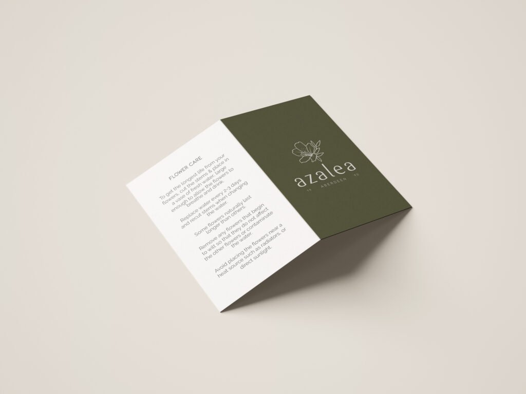
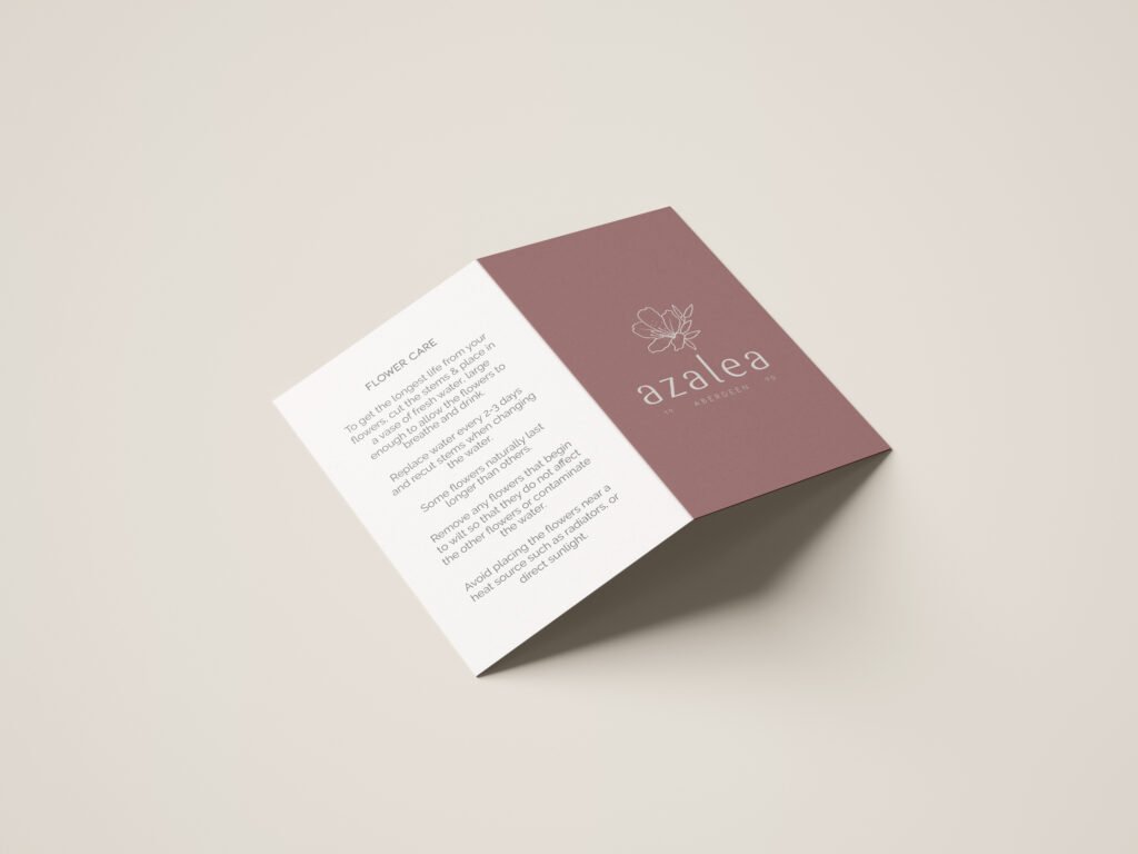
For Ola’s colour palette I chose some gentle, warm tones. The Heather and Oat colours to signify Scotland, a warm olive green to compliment and a dark charcoal grey to match her new shop interior.
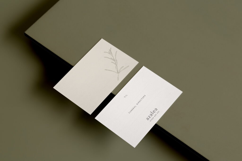
Preview some of the work we created together below:
Services Included:
Logo Design
Rebrand
Secondary Logo Design
Colour Palette & Font Selection
Business Stationery

