When Emma first came to me, she mentioned that she had chopped and changed her branding many times over the years as part of the growing process, but that now as an established business she wanted something to take her to the next level.
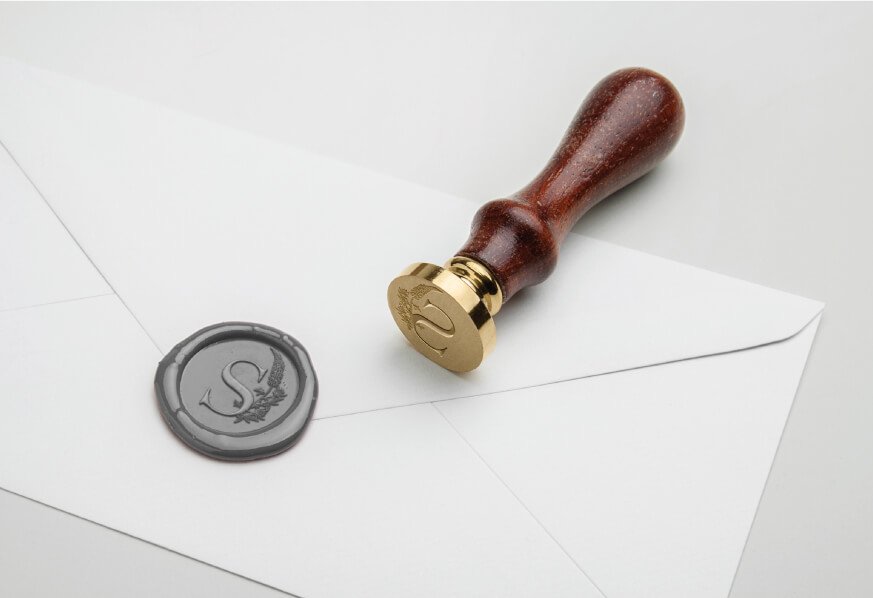
During an initial phone call, we covered a few inspirations including her favourite foliage, florals and elements of the job but then Emma started to talk about Lupins. I don’t think I’ve ever heard such limitless love and joy when talking about a flower. As she described them to me she could have been talking about a dear old friend. It was an infectious feeling. So it became immediately obvious that this lupin was to become the heart of her branding.
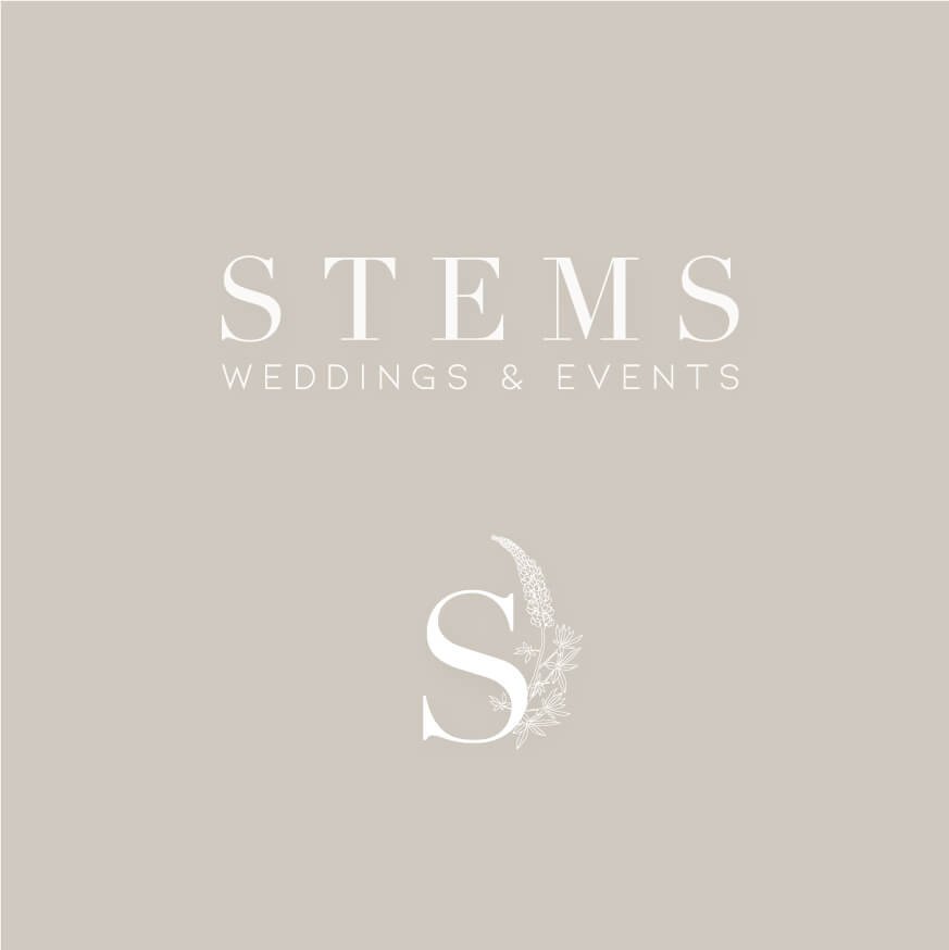
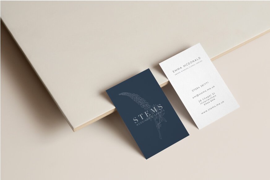
Building on the foundations of the lupin, the atmosphere she wanted to create was elegant, professional and something just a little bit different. This we interpreted into Emma’s colour palette. Wanting to stray away from greens and pretty pinks, we settled on a deep navy, a couple of neutrals and a bright terracotta accent.
Check out some of the work we created in action below.